
Why join us?
Shaping the future of assistance and insurance takes a supported and empowered team. Here are a few ways we invest in your growth, security, and happiness from day one.
At Allianz Partners, you’ll find more than just a role; you’ll be part of a collaborative, inclusive environment where your ideas are valued and your impact is visible. We empower you to grow with confidence through meaningful opportunities, a strong focus on work-life balance, and the support you need to thrive as we shape the future together.
Flexibility & balance
We value flexibility as part of our hybrid workplace model. Our flexible ways of working can help you work in ways most effective so you can enjoy flexibility to care for you and your family.
Career development & learning
We provide opportunities to grow professionally and personally. From specific training programs to coaching & mentoring sessions, our employees have the opportunity to continue to learn as their career progresses.
Health & Well-being
We care for our people. That’s why we offer comprehensive protection and everyday support for your physical and mental health.
Fair pay & recognition
We understand the importance of valuing your work today and in the long run, which is why we are committed to providing competitive pay and meaningful recognition.
CMS Page Creation Guide
This guide sets the standard for creating pages in the CMS. Its purpose is to ensure that all pages are:
By following these guidelines, content teams can create pages that are user-friendly, inclusive, and aligned with quality and accessibility expectations.
- Consistent in structure and presentation
- Clear and easy to navigate
- Accessible to all users
- Optimized for desktop, tablet, and mobile devices
Scope:
These guidelines apply to all CMS page creation and page editing activities carried out by Content Managers, Site Managers, or any user responsible for publishing or updating website pages
Core Principles:
When creating a page, always aim for the following:
- Clarity: Content should be easy to read, easy to scan, and easy to understand.
- Consistency: Pages should follow the same structural and formatting standards across the site.
- Accessibility: Pages should support users who rely on assistive technologies, keyboard navigation, or smaller screens.
- Relevance: Every section, widget, image, and link should serve a clear purpose.
Preparation before CMS
Once the content draft is ready, it should be reviewed and arranged according to the required webpage structure before it is created in the CMS. So, following are the steps to be followed to structure that content so it works effectively as a webpage.
Every page must begin with a clear and descriptive main title (H1). The title should:
- Reflect the purpose of the page
- Be concise and meaningful
- Help users immediately understand what the page is about
- Avoid vague or overly creative titles that may reduce clarity.
Include a brief introduction directly below the title, typically within the hero section. This description should:
- Provide a summary of the page content
- Set the context and expectations for users
- Be limited to 2–3 short sentences
- Ensure the text is easy to read and avoids unnecessary complexity.
Divide the content into logical sections based on topics or themes. Each section should:
- Focus on one key idea or topic
- Avoid large blocks of unstructured text.
- Avoid unnecessary jargon and long sentences.
Assign a clear heading (H2/H3) to each content section. Headings should:
- Be descriptive and concise
- Help users scan the page quickly
- Reflect the content within the section accurately
- Maintain a consistent heading hierarchy(H1-> H2 -> H3/H/H5) across the page.
- Arrange sections in a natural and logical order, guiding the user smoothly through the page.
Each webpage is built using smaller building blocks called widgets, with every content section implemented through an appropriate widget. Editors must evaluate each section of the content and:
Widget Selection Guidelines
- Identify the most suitable widget from the approved Widget library that best fits the content and its purpose.
- Ensure the selected widget aligns with content type, structure, and user experience expectations
- Avoid ussing unnecessary or excessive widgets that do not align with the content structure
- Ensure consistency by using only approved widgets defined in the Widget Library
Widget Selection Guidelines
- Choose widgets that best support the content presentation, such as:
- Hero widgets must be the very first widget for main page title and intro
- Text widgets for detailed information
- Card/tile widgets for grouped or categorized content
- Accordion widgets for FAQs or expandable sections
- Carousel type widgets for employee stories, helpful tips, etc.
Identify where images, icons, or widgets can enhance understanding.
Ensure that:
Ensure that:
- Visuals are relevant and purposeful
- They support the content (not distract from it)
- Use only approved icons which are already available in the CMS. Refer to the icons list uploaded in the CMS
- Use only high-resolution images (Clear and non-pixelated) and format it to the required dimensions mentioned in your selected widget.
- If videos need to be added, be ready with the video and thumbnail of that video.
Ensure all:
- Links are functional and correctly directed
- CTAs are clear and actionable (e.g., Apply Now, Learn More)
- Avoid broken links or unclear button labels.
Perform a final check to ensure:
- Content is accurate and complete based on the above steps
- Grammar and spelling are correct
- All-set with the formatted visual elements like images, videos, and/or icons
- Identified best fit widgets for each section
Create a page: Step-by-step
Once the content has been prepared and structured, the next step is to create and configure the page within the CMS. This involves adding appropriate widgets, adding content, configuring links, and ensuring that the page meets quality, design, and accessibility standards.
- Choose the template you want to create and duplicate that page by clicking on the three dots.
- Provide page name
- choose the locale
- choose the theme as Allianz_Global
- Choose the appropriate header and footer from the dropdown
- choose the folder
- Save
Every page must begin with a Hero widget
The Hero widget:
Displays the main page title and introductory description
Sets the context and visual identity of the page
Guidelines:
Use the Hero widget only once per page
It must always appear at the top
Do not reuse Hero widgets in other sections of the page
The Hero widget:
Displays the main page title and introductory description
Sets the context and visual identity of the page
Guidelines:
Use the Hero widget only once per page
It must always appear at the top
Do not reuse Hero widgets in other sections of the page
Used for displaying informational or descriptive content
Guidelines:
Keep text concise and easy to read
Break content into:
Short paragraphs
Bullet points where applicable
Avoid large text blocks that reduce readability
Guidelines:
Keep text concise and easy to read
Break content into:
Short paragraphs
Bullet points where applicable
Avoid large text blocks that reduce readability
Used when content needs visual support alongside text
Guidelines:
Ensure the image is:
Relevant to the content
Properly aligned (left/right based on layout)
Maintain balance between text and visuals
Use high-quality, properly formatted images
Guidelines:
Ensure the image is:
Relevant to the content
Properly aligned (left/right based on layout)
Maintain balance between text and visuals
Use high-quality, properly formatted images
Used to display multiple items within limited space (e.g., cards, highlights)
Guidelines:
Use only when necessary (avoid overuse)
Ensure:
Each slide has clear and meaningful content
Navigation is smooth and user-friendly
Guidelines:
Use only when necessary (avoid overuse)
Ensure:
Each slide has clear and meaningful content
Navigation is smooth and user-friendly
Used for:
FAQs
Long or detailed content
Guidelines:
Keep headings clear and descriptive
Ensure content inside each accordion is structured and concise
FAQs
Long or detailed content
Guidelines:
Keep headings clear and descriptive
Ensure content inside each accordion is structured and concise
Used to display or link to social media platforms
Guidelines:
Use only where relevant
Ensure links are:
Correct
Up to date
Guidelines:
Use only where relevant
Ensure links are:
Correct
Up to date
Icons are used to enhance visual clarity and content scanning
Guidelines:
Use only approved icons
Ensure:
Icons are consistent in style
Icons clearly represent the associated content
Do not use icons excessively
Guidelines:
Use only approved icons
Ensure:
Icons are consistent in style
Icons clearly represent the associated content
Do not use icons excessively
All links must be properly configured and tested
Guidelines:
Use:
Clear and meaningful link text (avoid “Click here”)
Ensure:
Links direct to the correct destination
External links open as per guidelines
Always test links before publishing
Guidelines:
Use:
Clear and meaningful link text (avoid “Click here”)
Ensure:
Links direct to the correct destination
External links open as per guidelines
Always test links before publishing
Upload only high-quality and optimized images
✅ Before Upload:
Ensure correct:
Dimensions
Aspect ratio (as per widget requirement)
File size (optimized for performance)
During Upload:
Use appropriate file naming
Add alt text for accessibility
✅ Before Upload:
Ensure correct:
Dimensions
Aspect ratio (as per widget requirement)
File size (optimized for performance)
During Upload:
Use appropriate file naming
Add alt text for accessibility
Videos should be used only when they add value to the content
Guidelines:
Ensure:
Video is relevant and necessary
Playback works properly across devices
Avoid excessive use of videos
Guidelines:
Ensure:
Video is relevant and necessary
Playback works properly across devices
Avoid excessive use of videos
Accessibility must be ensured for all content elements
Guidelines:
Provide alt text for:
Images
Icons (if required)
Ensure:
Proper heading hierarchy
Content is readable using assistive technologies
Guidelines:
Provide alt text for:
Images
Icons (if required)
Ensure:
Proper heading hierarchy
Content is readable using assistive technologies
Do not:
Use unapproved widgets
Upload low-quality or improperly formatted images
Overload the page with too many widgets
Use unclear headings or vague link texts
Duplicate Hero widgets
Use unapproved widgets
Upload low-quality or improperly formatted images
Overload the page with too many widgets
Use unclear headings or vague link texts
Duplicate Hero widgets
Before publishing, ensure:
All content is accurate and properly placed
Widgets are correctly configured
Links are tested
Page works across devices
Accessibility requirements are met
All content is accurate and properly placed
Widgets are correctly configured
Links are tested
Page works across devices
Accessibility requirements are met
Page Creation in the CMS: Do's and Don'ts
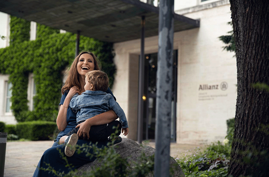
Start every page with H1 title
Start every page with one hero widget
Make sure that the page has only one h1 title.

Do not use any hero widgets in any other place of the page
Hero widgets contain H1 title. Do not use hero widgets anywhere middle or end of the page. This affects the page structure and accessibility.
Follow logical heading hierarchy
Page should have the following logical heading hierarchy: H1, then H2, then H3, H4 or H5.
Do not place widgets by turning off titles which affects logical hierarchy
IF you turn off widget title, then logical order may affect.
Add Aria labels where needed
Keep the link text and button text more clear. If it's shortened, add meaningful aria label.
Do not add tooltips for links and buttons
No need to add tooltips as it may affect the usability. Keep tooltips empty.
Add images of high quality
Use relevant, high-quality images only
Ensure the image supports the page content
For logos, awards, or images containing text, use SVG format where possible If SVG is not available, ensure the image remains readable and provide appropriate alt text.
Ensure the image supports the page content
For logos, awards, or images containing text, use SVG format where possible If SVG is not available, ensure the image remains readable and provide appropriate alt text.
Alt text for images
Leave alt text empty if the image is meaninful
Add alt text when:
The image contains meaningful information
The image is a logo, award, badge, or icon with meaning
The image is required to understand the content
Example: If the image is the Allianz Pride logo, use alt text such as: Allianz Pride logo
Leave Alt Text Empty
When Alt text should be left empty if the image is purely decorative and does not add meaningful information.
Do not add Alt text for every image
Avoid Non-Meaningful Alt Text that describes generic visual scenes without supporting content meaning.
Example of weak alt text Employee smiling and collaborating with colleagues
Unless the image is central to the message, this type of text adds little value for screen reader users.
Example of weak alt text Employee smiling and collaborating with colleagues
Unless the image is central to the message, this type of text adds little value for screen reader users.
Video
Widgets
Use only approved widgets
We understand life has twists and turns, which is why we offer attractive, fair, and sustainable benefits, in all of our entities. Find out which benefits are waiting for you at Allianz.
Page Creation: Dos' and Donts'
The following structure must be followed for every page.
Use a single H1 heading to describe the main purpose of the page. Always place a Hero widget as the first section (use only one hero widget per page).
Hero must include:
Why this matters: A clear, single page title and structured headings help users scan and navigate content more easily.
Please see the approved Hero layouts (use only these) and do not use these hero layouts anywhere on the page:
Hero must include:
- Page Title ON (main title)
- A short description
- Optional primary button/link (if needed)
Why this matters: A clear, single page title and structured headings help users scan and navigate content more easily.
Please see the approved Hero layouts (use only these) and do not use these hero layouts anywhere on the page:
- New Hero video with text left
- New Hero video with search bars
- New Hero image with two column text
- New hero image with video button
- H1_Header
Organize content using a clear heading hierarchy.
Follow a logical order. Do not skip heading levels.
Guidelines:
For every widget after the Hero:
Turn Title = ON
Use the title to clearly describe that section (like a chapter heading)
Why this matters: Section titles provide structure, helping users quickly locate what they need.
Follow a logical order. Do not skip heading levels.
Guidelines:
For every widget after the Hero:
Turn Title = ON
Use the title to clearly describe that section (like a chapter heading)
Why this matters: Section titles provide structure, helping users quickly locate what they need.
Use descriptive link text wherever possible that clearly communicates the destination or action.
For example, Use "EXPLORE MORE JOBS" instead of just "EXPLORE MORE"
If the link text is just "EXPLORE MORE", then add descriptive text in the Aria-label field as in the screenshot.
Important: Please do not fill the tooltip field. Leave it as empty.
For example, Use "EXPLORE MORE JOBS" instead of just "EXPLORE MORE"
If the link text is just "EXPLORE MORE", then add descriptive text in the Aria-label field as in the screenshot.
Important: Please do not fill the tooltip field. Leave it as empty.
Image selection:
Use relevant high quality images.
Use svg type of images in case of any awards/logos to make the text readable. If not available, provide alternative text accordingly.
For example, if the image is Allianz Pride logo, then the alternative text would be "Allianz pride"
Avoid alt text for decorative images that add little value.
For example, "Eemployee smiling and collaborating with colleagues" which adds no value to the context. Avoid such kind of alt text.
Always provide alt text for images of logos, awards, etc.
Leave alt text empty if the image is purely decorative.
Content checklist:
The page has only one H1 heading/title.
Heading follow a logical hierarchy
tooltip fields of link text/button text are empty
Link text/Aria label is meaningful
Images have appropriate alt text
Content is concise and easy to scan.
Sentences are short and understable
Avoid use of jargons. use plain language.
Before publishing:
Review page layout in all device modes like tablet and mobile mode.
Check links and buttons are redircting to correct page.
Verify image quality
confirm heading structure
Remove placholder content
Review page layout in all device modes like tablet and mobile mode.
Check links and buttons are redircting to correct page.
Verify image quality
confirm heading structure
Remove placholder content
Join us. Let's care for tomorrow.
Explore your career opportunities at Allianz
Explore Allianz
At Allianz, our commitment to excellence and innovation transcends borders. With a robust global presence, we have established a network of offices and partnerships in key markets around the world. This strategic positioning enables us to understand diverse markets, cater to local needs, and deliver tailored solutions that resonate with our clients.
Benefits Done Right
Your ambitions, your dreams, your challenges matter to us. Today and tomorrow.

Welcome Actuaries
Let’s care for tomorrow. For making the future less unpredictable. For building your own future with for a financially strong and successful company. At Allianz, you can help us create innovative products and focus on future trends. Explore our opportunities in actuarial services.

H1 Header
H3 Body Text Sample H3 Body Text Sample H3 Body Text Sample H3 Body Text Sample H3 Body Text Sample H3 Body Text Sample H3 Body Text Sample H3 Body Text Sample H3 Body Text Sample H3 Body Text Sample H3 Body Text Sample H3 Body Text Sample H3 Body Text Sample H3 Body Text Sample H3 Body Text Sample H3 Body Text Sample